You've prepared your CV's content, quantified your achievements, and created a profile targeting your perfect role. Now the time has come to select a font to make that content POP. While there are multiple 'safe' fonts to choose from, a little judicious use of formatting can bring your CV alive and make it more inviting to read.
Recommended
- Calibri The safe, ATS-friendly standard.
- Garamond Elegant & traditional authority.
- Roboto / Lato Modern, digital, and space-saving.
Avoid
- Comic Sans Completely unprofessional.
- Times New Roman Dated and overused.
- Arial Functional, but often too bland.
📊 The Psychology of Type
Did you know? Research from the University of Michigan (Song & Schwarz) suggests that when a font is difficult to read, people subconsciously perceive the tasks described as being more difficult to perform. Conversely, clean typography leads to a perception of efficiency and competence.
What are the best fonts to use in a CV?
Georgia and Garamond Established Authority
These fonts are a modern take on the timeless (but overused) Times New Roman. They are ideal for traditional or academic roles. For more creative positions, such as marketing, you might consider something a little more modern.
Cambria Monitor Optimised
This serif font is packaged as standard with the Microsoft Office suite. Predominantly designed to optimise visual appeal on a monitor, this font works exceptionally well on paper, too.
Calibri ATS Gold Standard
Calibri is one of the most commonly used fonts on CVs today. Introduced to replace Times New Roman as Word's default, it is a "safe" choice. It is clean, simple, and prevents unnecessary distraction, making it highly recognisable to recruiters.
Feeling a little more creative? Try these:
Lato Boutique Aesthetic
Lato is a great font if you are looking to stand out while maintaining a professional image. Note that this isn't a standard system font; you will need to download it via Google Fonts.

Constantia Modern & Relaxed
Constantia's naturally rounded structure results in a more relaxed, less "corporate" appearance. Like Lato, this is a non-standard font that requires downloading.
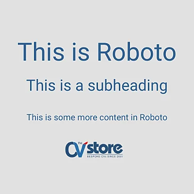
Roboto Digital & Space-Saving
This is one of our personal favourites. Created by Google (primarily for mobile screens), Roboto is ideal for creative applicants. If you are struggling for space, Roboto's rounded lettering and spacing mean your content remains legible even at smaller sizes.
What Recruiters Really Think
We recently asked a recruiter for their unfiltered opinion on a selection of common CV fonts:
What fonts should you avoid?
Arial Bland / Overused
Surprisingly, this font can be controversial. While popular, it is often derided for its blandness. If you want something more visually appealing with high legibility, consider using Tahoma or Verdana.
Comic Sans The Fatal Error
Developed in the 90s for a "comic book" feel, this font should be avoided at all costs on a professional document.
Century Gothic ATS Parsing Risk
While it looks tidy, its thin lettering can make text hard to read and potentially cause issues with ATS (Applicant Tracking Systems) parsing.
Does font use really matter?
Yes! You need to consider two elements: aesthetics (for "human" recruiters) and functionality (for ATS readability). If you are struggling to pick, Calibri is a great middle-ground that caters to both.
Serif vs. Sans Serif
Think of sans serif fonts as being "without tails" (serif). Generally, sans serif fonts are the safest option, though serif fonts remain excellent for traditional roles.
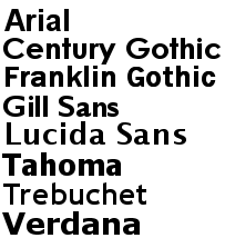
Sans Serif (Modern)
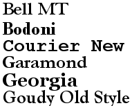
Serif (Traditional)
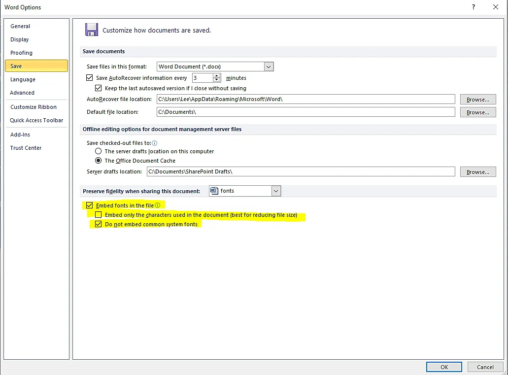
How to embed non-standard fonts
With your CV open in Microsoft Word, click "File", then "Options" and "Save". Look for "Preserve fidelity when sharing this document" and tick the boxes. To keep the file size small, ensure "Embed only the characters used" is also ticked.
Can I use coloured text? No. Avoid using anything that isn't black or dark blue. Similarly, avoid wacky fonts that distract from your professional message.
Should I use different fonts for titles and content? Yes, this helps in distinguishing sections. You can also use bold text to make your headers stand out more clearly.

Need help with your CV's design?
We provide professionally written and formatted documents tailored to your career goals.

