When writing a CV, there are many important design decisions to make: how many pages? What font? Which keywords? However, the importance of white space is often overlooked. Although the majority of applications are screened by ATS software where design is less critical, you still need to create an eye-catching and well-organised document that attracts a human recruiter's attention.
White space (often referred to as "negative space" in design) is the area of your CV that remains unused when separating sections and paragraphs of text. There is a fine balance between too much and not enough. Too little creates a feeling of clutter and disorganisation; too much leaves your CV feeling bare and thin on content.
Research shows that white space between paragraphs and in the left and right margins increases comprehension by almost 20%. Readers find it easier to focus on and process generously spaced content (Lin, 2004).
White space helps guide a recruiter's eye seamlessly through each section. Rather than wading through hundreds of words crammed onto an A4 page, well-placed white space combined with clear section titles creates focal points - making your content genuinely inviting to read.
How to Create White Space in a CV
-
Use line spacing Microsoft Word allows you to increase line spacing between text. A simple adjustment here can significantly enhance readability. Aim for 1.15 to 1.3 between lines - enough to breathe without wasting space.
-
Keep bullet points short Your achievements should be listed in bullet point format. When doing this, try to limit each bullet to one line. A wall of multi-line bullets is visually indistinguishable from a paragraph and loses the scanning benefit entirely.
-
Be consistent When listing jobs and qualifications, use the same format for company name, job title, and date throughout. Don't switch between bold, italic, and underlined text - inconsistency creates visual noise that undermines the sense of organisation.
-
Play with margins There is no single correct margin width for a CV. Consider tweaking yours to find what looks comfortable. Anywhere between 0.5 inches and 1 inch on each side generally works well - go below 0.5 inches and the document starts to look cramped.
-
Avoid leaving pages half-filled A CV with a half-empty second page can create doubt in a recruiter's mind - their first reaction will be "this candidate doesn't have enough experience to fill the page." If you run over to a second or third page by only a few lines, consider reformatting slightly to reduce the page count instead.
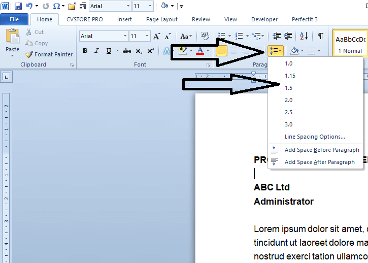
Adjusting Line Spacing in Microsoft Word
Go to Home > Line and Paragraph Spacing (or right-click selected text and choose "Paragraph") to access line spacing controls. Set your body text to 1.15 or 1.2 for a clean, open feel without sacrificing too much space.
Before and After: The Visual Difference
The two examples below show the same CV content - the only difference is how the white space has been handled. The impact on readability is immediate.
Poor Use of White Space
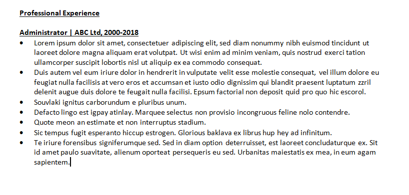
Cluttered and hard to read - the eye has no clear entry point.
Good Use of White Space
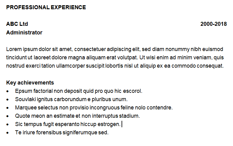
A few simple tweaks create a document that is genuinely inviting to read.
The right balance between content and white space can make a surprising difference to a recruiter's first impression. Used well, it transforms a document that looks like work to read into one that looks like a pleasure.
For a broader look at how layout decisions affect the way recruiters scan your CV, see our guide to CV design using the quadrant method.
Want a CV that looks as good as it reads?
Our expert writers deliver professionally formatted documents that balance content and white space to make the right impression every time.
