Most CV advice focuses entirely on what you write. Far less attention is paid to how it looks - yet visual design is one of the primary reasons a strong CV gets overlooked. A recruiter processing hundreds of applications in a single day is not reading every word. They are scanning. Understanding how the human eye moves across a page, and designing your CV around that behaviour, is one of the simplest and most effective improvements you can make.
The average time a recruiter spends on an initial CV scan before deciding whether to read further. Your design either earns that second look - or it doesn't.
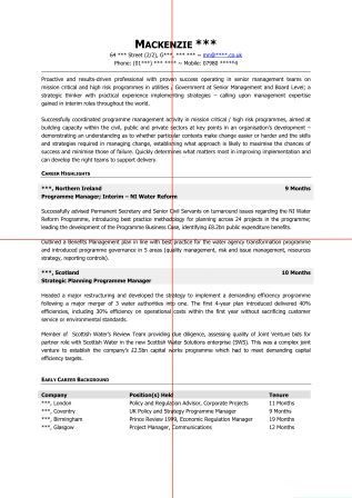
How Recruiters Actually Read a CV
Eye-tracking studies show that when a person scans a new document, their gaze follows one of two predictable patterns depending on the layout:
The Z-Pattern
Used on clean, uncluttered pages. The eye starts top-left, sweeps across to top-right, drops diagonally to bottom-left, then sweeps right again - tracing a Z shape. This is the most common pattern for CVs with clear structure and generous white space.
The F-Pattern
Used on dense, text-heavy pages. The eye reads the first line fully, then progressively shorter horizontal sweeps down the left edge - forming an F. If your CV triggers F-pattern reading, the recruiter is likely to miss most of it.
Your goal as a CV designer is simple: create a layout that encourages Z-pattern scanning, not F-pattern skimming. The quadrant method is the practical tool for achieving this.
The Quadrant Method
Print your CV and fold it twice - once horizontally and once vertically - so you have four equal quadrants. Now look at each section and ask: is the text and white space roughly balanced across all four areas?
Top Left - Prime Real Estate
This is where the eye lands first. Your name, job title, and the first line of your personal profile must be here. This quadrant sets the entire tone of the document.
Top Right - Supporting Identity
Contact details, LinkedIn URL, and location. Keep it clean. Avoid cluttering this area with lengthy addresses or multiple phone numbers.
Bottom Left - Career Anchor
Typically the start of your employment history. The most recent role should begin here with a strong, achievement-led opening line.
Bottom Right - Supporting Evidence
Earlier career, education, or skills. This quadrant confirms what the top half has already sold - it should be concise, not exhaustive.
The Balance Test
If three of your quadrants are dense with text and one is almost empty, your layout is unbalanced. Equally, if one quadrant is entirely white space, the document will feel lopsided. Aim for a rough visual balance - not mathematical perfection, but enough harmony that no single area feels overwhelming or neglected.
White Space: The Most Underused Design Tool
White space is not wasted space. It is what allows the eye to move comfortably between sections, and it is what separates a document that feels professional from one that feels desperate. Many candidates, anxious about fitting everything in, reduce margins, shrink line spacing, and cram content into every available inch. The result is a CV that no one wants to read.
For a full breakdown of how to use white space effectively on a CV - including margin guidance, line spacing rules, and section spacing - read our guide: How to Use White Space on a CV.
What ATS Systems "See" vs What Humans See
This is the tension at the heart of modern CV design: a document that looks beautiful to a human recruiter may be completely unreadable to the ATS software that processes it first. Understanding this dual audience is essential.
ATS-Friendly Design
- Single-column layout
- Standard section headings (e.g. "Work Experience" not "My Journey")
- Simple bullet points - no icons or symbols
- Web-safe fonts (Calibri, Arial, Fira Sans)
- Contact details in the main body, not in a header or footer
- Saved as .docx for job sites / portals; PDF for direct email applications
ATS-Hostile Design
- Multi-column layouts (text order becomes scrambled)
- Tables used for layout (cells are often read out of sequence)
- Text boxes (frequently skipped entirely)
- Icons and graphics used instead of text
- Headers and footers containing key contact information
- Decorative or non-standard fonts
The safest approach is to design primarily for ATS readability, then layer in the visual polish that makes it compelling to a human. A clean single-column layout with strong typography, generous white space, and good quadrant balance will satisfy both audiences. For more on passing the ATS filter, see our ATS-friendly CV guide.
The Quick Design Checklist
Before You Send: A Visual Audit
- ✅ Print and fold into four quadrants - is the text and white space roughly balanced?
- ✅ Hold the document at arm's length - does it look clean and inviting, or dense and intimidating?
- ✅ Can you identify your name, current job title, and most recent employer within two seconds?
- ✅ Are all section headings consistent in size, weight, and position?
- ✅ Are margins at least 1.5cm on all sides?
- ✅ Have you tested the PDF on a mobile screen?
- ✅ Does the document use a single column with no tables or text boxes?
Want a professionally designed CV?
Our expert writers deliver documents that are visually compelling for recruiters and technically optimised for ATS - every time.