CV Design Using The Quadrant Method
Visual appeal is something you should always take into consideration when writing your CV. As with an interview, the first impression given by your CV is often the most important. As a recruiter sifting through numerous CVs all day, it is unlikely to stand out if it looks messy, too wordy, too long…the list goes on.
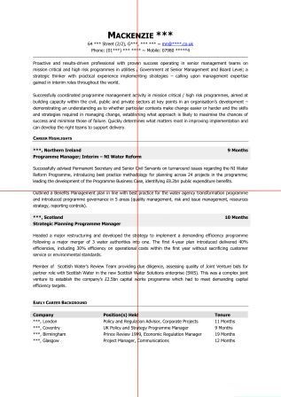
To help combat this, when writing your CV, try using the ‘quadrant’ method. 99% of people, when reading text, begin at the left side of a page and work across the document in a Z pattern. Taking this into consideration, try designing your CV so that the most important information (or keywords) are located at the top left of the page.
"A good balance of white space and text can significantly enhance your CV's visual appeal!!
In addition, the balance of text and white space is essential! This is where the ‘quadrant’ method comes into play. To do this, print off your CV and split it into 4 equal sections (see image above). Then, try and balance the text and white space as equally as possible.
Not only does using this method help in making your CV more visually appealing but it goes a long way to making it easy to scan (where recruiters quickly look over the document, rather than reading in detail).
